SASS(Syntactically Awesome Style Sheets)
기존 CSS의 단점을 보완하고 효율성을 높이기 위해 만들어진 문법
CSS 코드 중첩, 변수화, 속성 재사용 등 여러 기능 제공
SCSS(Sassy CSS)
SASS 3버전에서 등장한 SASS의 신버전으로 호환성, 가독성이 좋아짐 (기존과 달리 중괄호 사용)
사용 준비
설치
npm install sass
scss 확장자로 변경
App.scss
index.scss
+ App.jsx와 main.jsx에서 Import하는 css파일도 바꿔주기!
// app.jsx
import './App.scss'
// main.jsx
import './index.scss'
문법
1. 변수
사용방법
/* 선언 */
$변수명 : 값;

/* 사용 */
선택자 {
  속성 : $변수명;
}
* 예시
App.jsx
function App() {
return (
<>
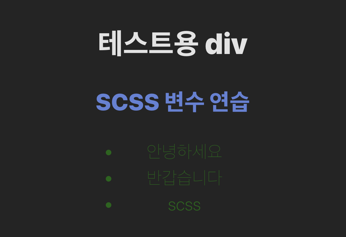
<div className="test">테스트용 div</div>
<h2>SCSS 변수 연습</h2>
<ul>
<li>안녕하세요</li>
<li>반갑습니다</li>
<li>scss</li>
</ul>
</>
);
}
App.scss
/* 폰트 크기 */
$font-large: 50px;
$font-mid: 40px;
$font-small: 30px;

/* 폰트 굵기 */
$font-bold: 900;
$font-thin: 200;

/* 색상 */
$color-green: #116511;
$color-blue: rgb(96, 130, 215);

.test {
  font-size: $font-large;
  font-weight: $font-bold;
}

h2 {
  color: $color-blue;
  font-weight: $font-bold;
  font-size: $font-mid;
}

ul {
  display: gird;
  gap: 10px;
}

li {
  color: $color-green;
  font-weight: $font-thin;
  font-size: $font-small;
}
2. 중첩
다음과 같은 html 구조가 있을 때 각각의 요소에 css 속성을 지정하기 위해서는
<element>
  <div>
    <span></span>
  </div>
</element>
보통 다음과 같이 사용했겠지만
element {
  color: white;
}
element div {
  color: gray;
}
element div span {
  color: blue;
}
scss에서는 중첩 기능을 제공해 아래와 같이 사용할 수 있다.
(하지만 2023년부터 기본 css에서도 중첩 선택이 가능해졌다... mdn 사이트)
element {
  color: white;

  div {
    color: gray;

    span {
      color: blue;
    }
  }
}
* 예시
App.jsx
function App() {
return (
<>
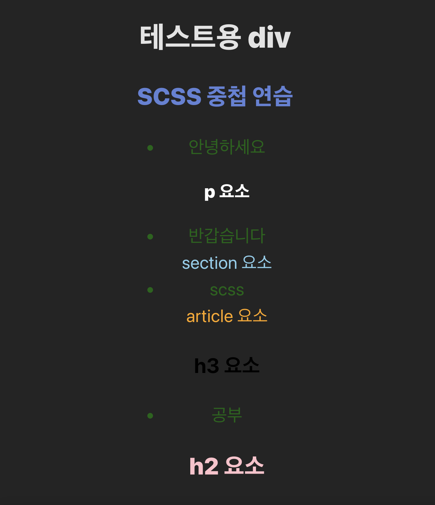
<div className="test">테스트용 div</div>
<h2>SCSS 중첩 연습</h2>
<ul>
<li>안녕하세요
<p>p 요소</p>
</li>
<li>반갑습니다
<section>section 요소</section>
</li>
<li>scss
<article>article 요소
<h3>h3 요소</h3>
</article>
</li>
<li>공부
<h2>h2 요소</h2>
</li>
</ul>
</>
);
}
App.scss
1번 변수 예시에서 썼던 코드에 일부를 추가했다
li {
  color: $color-green;
  font-weight: $font-thin;
  font-size: $font-small;

  /* 부모 규칙에 의해 일치하는 요소 선택,
  이 경우에는 li요소 자신 자체를 hover시 적용됨 */
  &:hover {
    background-color: lightgray;
  }

  p {
    color: white;
    font-weight: $font-bold;
  }

  section {
    color: skyblue;
  }

  article {
    color: orange;

    h3 {
      color: black;
    }
  }

  h2 {
    color: pink;
  }
}
3. 믹스인(Mixin)
믹스인이란 반복되는 코드를 재사용할 수 있게 해주는 틀이다.
함수처럼 사용할 수 있다.
사용 방법
/* 틀 만들기 */
@mixin 믹스인이름 {
	코드
}

/* 틀 사용하기 */
@include 믹스인이름;
예시 1
App.jsx
function App() {
  return (
    <>
      <div className="test">테스트용 div</div>
      <h2>SCSS 믹스인 연습</h2>
      <ul>
        <li>안녕하세요</li>
        <li>반갑습니다</li>
        <li>scss</li>
      </ul>
      <section>
        <article>SCSS 문법에는</article>
        <article>변수 사용,</article>
        <article>중첩 문법,</article>
        <article>믹스인 등이 있다.</article>
      </section>
    </>
  );
}
App.scss
1번 변수에서 썼던 코드에 일부를 추가했다.
- 믹스인을 사용하지 않았을 때
ul {
  display: flex;
  flex-direction: column;
  align-items: start;
  justify-content: center;
  gap: 10px;
}

section {
  display: flex;
  justify-content: space-between;
  align-items: center;
  gap: 20px;
  width: 100%;
}
- 믹스인을 사용했을 때
이 때 section에서는 flex-direction의 값을 따로 설정하지 않았었는데,
그럴 때는 기본값인 row를 적어줘야 한다.
@mixin flex($direction, $align, $justify, $gap) {
  display: flex;
  flex-direction: $direction;
  align-items: $align;
  justify-content: $justify;
  gap: $gap;
}

ul {
  @include flex(column, start, center, 10px);
}

section {
  @include flex(row, center, space-between, 20px);
}
만약 그게 불편하다면 direction을 파라미터의 맨 뒤로 빼준 다음, 초기값을 미리 설정해줄 수 있다.
@mixin flex($align, $justify, $gap, $direction: row) {
  display: flex;
  flex-direction: $direction;
  align-items: $align;
  justify-content: $justify;
  gap: $gap;
}

ul {
  @include flex(start, center, 10px, column);
}

section {
  @include flex(center, space-between, 20px);
}
그 외에도 여러개의 속성을 따로 설정하고 싶지 않은 것이 있다면
처음 선언할 때 모두 초기값을 설정해준 뒤,
사용 할 때 인자에 속성도 함께 넣어 명시해주면 된다.
@mixin flex($align: start, $justify: start, $gap: 0, $direction: row) {
  display: flex;
  flex-direction: $direction;
  align-items: $align;
  justify-content: $justify;
  gap: $gap;
}

ul {
  @include flex($gap: 10px, $direction: column);
}
예시 2
App.jsx는 예시 1과 동일하다.
App.scss
/* 폰트 크기 */
$font-large: 50px;
$font-mid: 40px;
$font-small: 30px;

/* 폰트 굵기 */
$font-bold: 900;
$font-thin: 400;

/* 색상 */
$color-green: #116511;
$color-blue: rgb(96, 130, 215);

/*...중략...*/

@mixin font($color, $size, $weight) {
  color: $color;
  font-size: $size;
  font-weight: $weight;
}

ul {
  @include flex($gap: 10px, $direction: column);
  @include font($color-blue, $font-mid, $font-bold);
}
초반에 생성한 변수를 믹스인에도 활용할 수 있는 것을 확인할 수 있다.

'react' 카테고리의 다른 글
| React / 스타일링 (3) - tailwindcss (0) | 2025.04.17 |
|---|---|
| React / 스타일링 (2) - Styled Components (1) | 2025.04.16 |
| React / custom Hook (1) | 2025.04.11 |
| React / useRef (0) | 2025.04.11 |
| React / 생명주기 (1) | 2025.04.10 |


